Pod
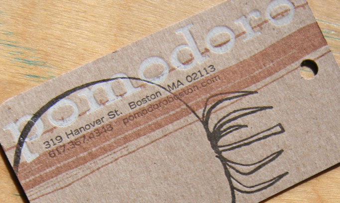
A client for over 18 years, pod is a retail shop that offers beautiful products for home, body and spirit. The visual identity has evolved over the years, with the most recent iteration designed to coincide with the shop’s move to Cambridge. The logotype was changed to Walbaum 120 to align with their sister venture, shop fog linen. Earthy tones, sometimes with metallic hints, make up the palette. The existing plant element was reimagined as simple line art, taking inspiration from plant drawings by Ellsworth Kelly.
Prior to the recent redesign, the identity used the typeface Bembo. The original design in 1998 employed a sophisticated palette of pale blue and warm gray with scans of actual plant clippings. The 2008 design simplified the leaf element and brought in texture, bolder colors and the addition of stitching on the business cards.

